
Principle 01
It is well known but you didn’t interested Japanese Typography. It is very basic thing. Japanese Font have two type. One is ‘Mincho’ font type and this type have same characteristic as serif font, It’s like Bodoni, Didot, Gramond, Times, for example. Another one is ‘Gothic’ font type and this type have the same characteristic as sans-serif font, It’s like Arial, Helvetica, Universe, Futura, for example. I introduce the example of two type which is I used most.
I bought lots of fonts which designer’s web page recommend. And I found the best two. The top one is the ‘AXIS Font’ I think it is the most same image to humanist modern sans-serif font. Under one is ‘Ryumin-KO’ font, I think it’s the most elegant ‘Mincho’ font.

Principle02
All Japanese font letter is made inside virtual square. Because Japanese Font used in vertical text layout and horizontal layout, square based design is good for both use cases. But Japanese text have not only ‘kanji’, but also ‘Kana’, and historically ‘Kana’ is not write in square face by hand. For this reason Japanese font is characterized by how to design the ‘kana’ face in square. Kanji design is changed in Japanese font but Japanese font face is change large by it’s ‘Kana’ design. (It include ‘Katakana’ is included why I say ‘Kana’) For this reason same font but only ‘Kana’ design changed is created lots. I show the example of this in next image.

This is the same type designer’s ‘Mincho’ font and all font have ‘Tsukushi Mincho’ in the name.Excuse me I made each font sample in 17px so difference is hard to see. I love I would use this font family lots. Because Which ‘Kana’ include font I choose, typography impression is controlled so much. Especially in ‘Tsukushi B old mincho’ and “Tsukushi C old Mincho’ I like the most. These two have lot’s of taste in handwriting. It’s so impressive because another font don’t have this kind of handwriting taste in ‘Mincho’ font. Also ‘Ryumin-KO’ is alternative font of ‘Ryumin’ which have old-style ‘Kana’ and normal Kanji mix font.
Prinsiple03
I already wrote ‘Kana’ design change the font’s impression. But not only impression but also long text’s readability is changed by ‘Kanji’ and ‘Kana’ face contrast. Japanese people read text so fast because Japanese people read lot’s of Japanese. It’s actually the same for another language native. But only for this reason, Japanese people read text fluently by used ‘Kanji’ and ‘Kana’ contrast. Kana have simple face and make fluent flow eye line, and ‘Kanji’ have complex face and eye stop once. This kind of flow and solid eye move make rhythm. Japanese word ‘Nagashi Yomi’ mean look over the book and roughly understand what is write. Which kind of thing could do because Japanese people used to ‘Kanji’ and ‘Kana’ contrast’s rhythm. Next image is showing this kind of thing in ‘Gothic’ font.
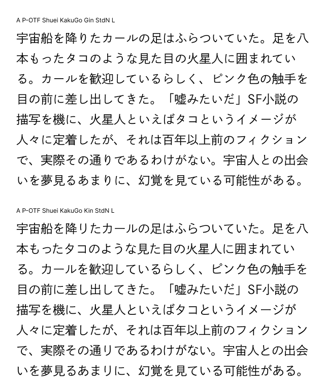
Pro designer not used this font often is actually don’t know what is different in ‘Shuei Kaku Go Kin and ‘Shuei kaku Go Gin’. But most Japanese people more readable with top one. Because which ‘Kana’ letter is created smaller than ‘Kanji’ letters. and more handwriting taste in design. Because of this long text could read smoothly. So Japanese people learn from parents or teacher, You must ‘Kana’ is little bit smaller than ‘Kanji’. You may think why so under one font is designed. It’s because Japanese font is virtual square base design, created font in full of square is modern impression it have. Like modern sans-serif it has geometrical face. In Japanese Font full of square ‘Kana’ is lot’s of virtual round space inside and type is geometrically beautifully aligned. In this font top is for long paragraph and under is for headline. This is the reason not so much different font is created.
Principle04
Because Japanese ‘Kanji’ have lot’s of element and most font designed in popular weight fast. Large weight not have space in letter element and created in worse font design. You must not use this kind of font. I show the example in Image.

All the font is same problem. In Japanese Font you can not use heavy weight, most font is not readable. Maybe font maker could sell lots of weight, so heavy weight is created. This four font is used lots of years so old problem is last is today.
Principle05
If you use the web design you can’t use the web font. Japanese Font have lots of character at least 10000 letters or more and have at least 1.6MB. You would like to make the responsive site mobile device can’t download this kind of huge file. Instead you could use figma’s SVG export function. But it’s time consuming to layout, so maybe paragraph and most smaller heading or maybe one more big heading you have to compromise each device font. But there is a pit fall in device font. Almost all the device font is designed Japanese font only and synthesize English font and adjust base line. Next Image is show the sample of this.

Because Japanese font is created square all the font have readable space around Japanese letter. But English text is tight in 17px in 0% tracking. This problem couldn’t avoid it. Only solution is not used English text with Japanese text in small size. Maybe 20px or more is no problem. But You would use 16px or 17px for base font size.


